Recently, I’ve been doing some simple editing for photos I’ve taken for a class, and in this post, I’m going to share some tips that I’ve learned through this process.
For this photo, I wanted to enhance the color and give it a more lively feel.
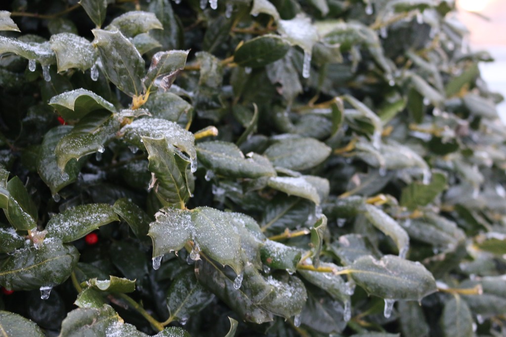
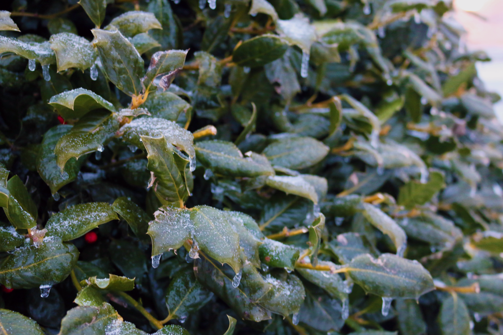
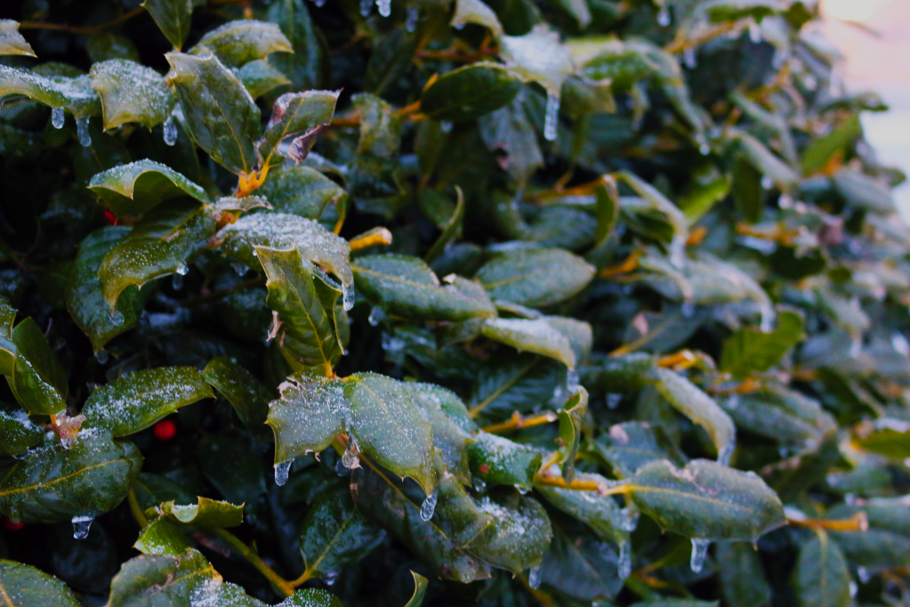
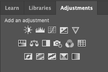
You can clearly see the change between these photos, and I’m going to show you what I used to get that change. I used Adobe Photoshop, focusing on the adjustments tab.
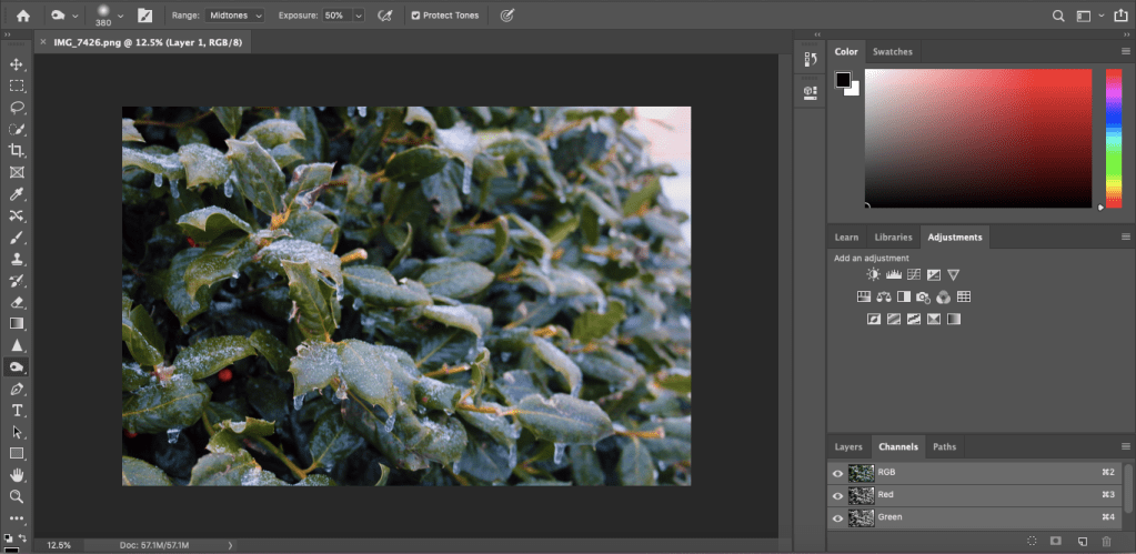
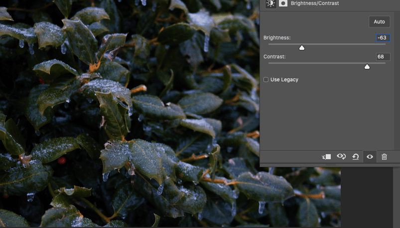
The first tool to look at is the brightness/contrast tool. With this tool, you can make the colors stand out more and make the image more striking overall. As I used the brightness tool, I really liked how the more shade there was, the more the ice stood out in the photo.
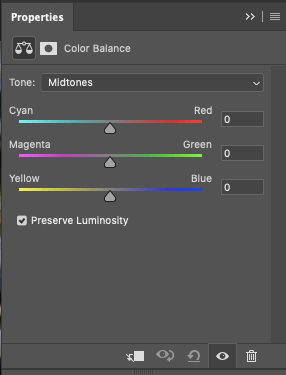
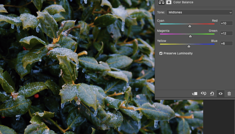
Another useful tool is the color balance option. This allows you to do things like make the yellow of the image more apparent and vice versa.
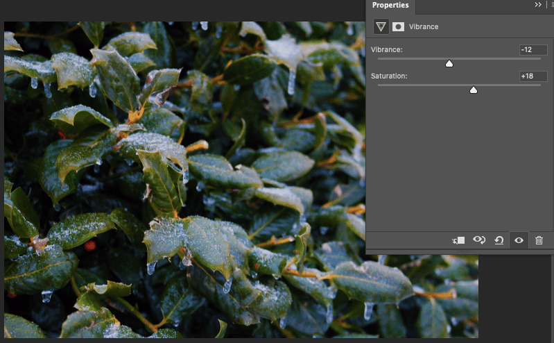
Next, we have the vibrance/saturation tool. Similar to the other tools, it enhances the color of the photo. The saturation can make the color a bit more intense, whereas the vibrance does more detailed work, enhancing colors that aren’t already saturated.
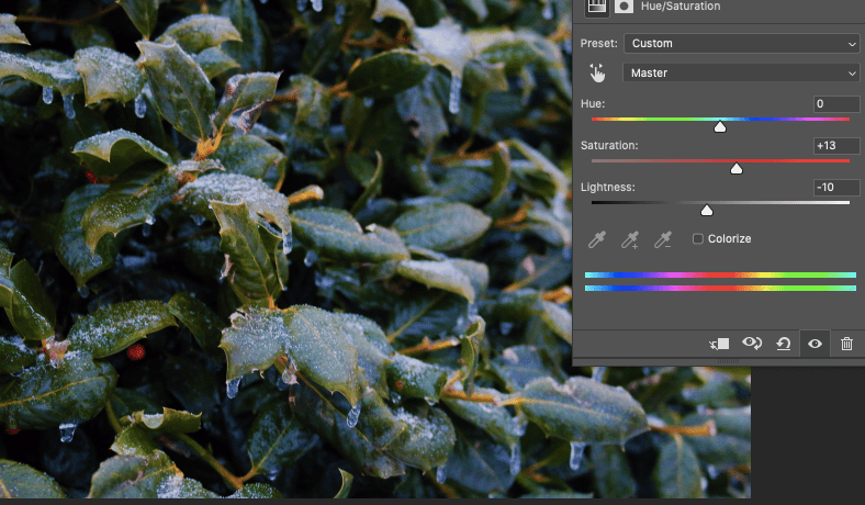
Lastly, we have the hue/saturation tool. The hue changes the photos’ primary color and gives a more “filter” effect, putting the image under a specific shade.
I hope these tool explanations are helpful for you as you work in Photoshop!
