Before you start working with watercolors, it’s good to know that when working with watercolors, you always want to start with light and go dark instead of doing the opposite. If you start dark and just so happen to make a mistake, it’s going to be much harder to fix that mistake by simply covering up with another color. Watercolor paint tends to be much lighter than what the cakes or tubes say.
Materials:
Watercolor paper
Basic set of soft paint brushes
Student grade watercolor set (watercolor cakes)
Small cup of water
Masking tape

Sky
Tape off the sides of your paper about 1/2 inch from the end and stick the other half to the table. This is a method to make sure that the paper doesn’t warp after it has dried. This is why is extremely important that you only use watercolor paper. It’s thicker and when it dries, it’ll be straight again. Never use something like printer paper. It isn’t made for that, so the water will bleed through.
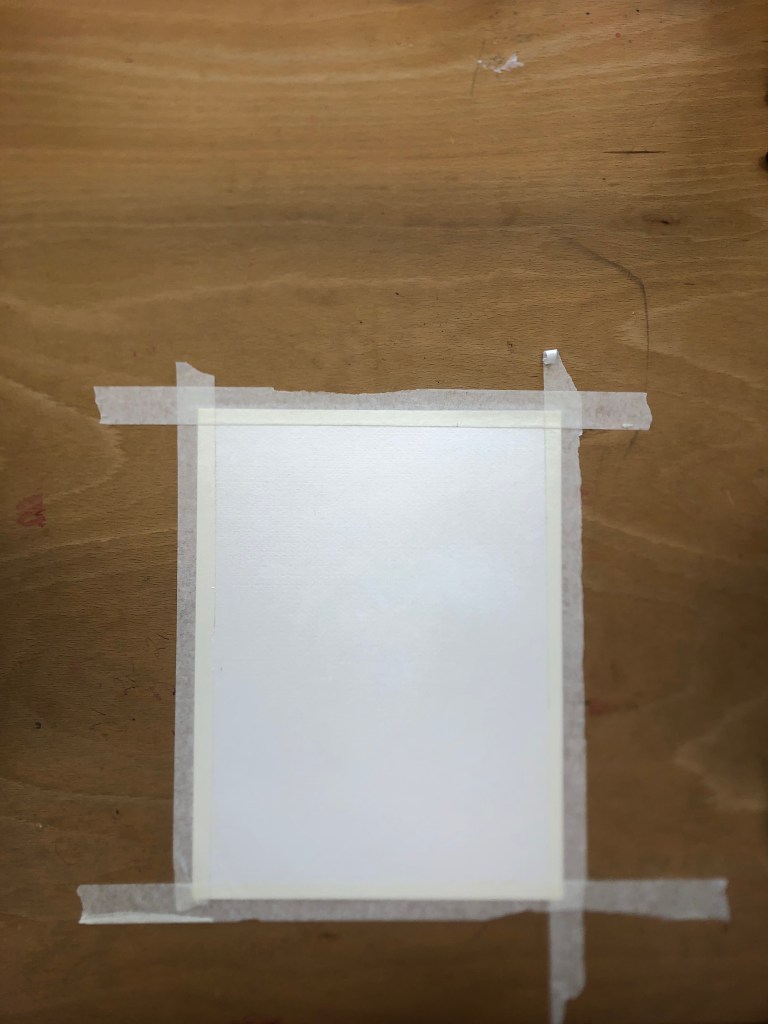
The final picture will have two different color sets, so pick a place on your paper where you want that border to be. Repeat step one for your middle border. Remember that the tape is going to be wider than it needs to be, so you’ll be doing some filling in later on.

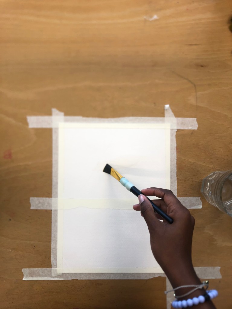
Dip your brush into your cup of water and lightly brush water across the upper half of your taped off area.
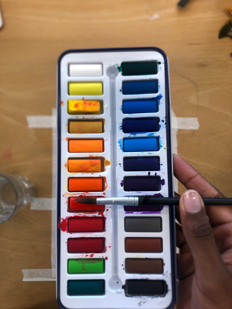
We’re going to start on the sky, so dip your current brush or a new brush into your cup of water, clean it off, and pick up your first color. I used a “darker” orange for my first color. I use quotations because once I mix it with a little water and put it onto the paper, it’s going to be a couple shades lighter than what you would think.
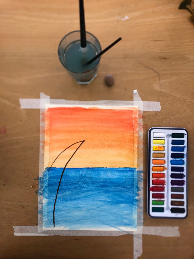
Repeat step 3 with the rest of your colors until the entire upper half of your paper is fully painted. When moving through colors, it’s good to use a color that’s either a shade lighter than the color before or a lighter shade of a completely different color that is close to the original color on the color wheel. Your brush strokes most likely won’t be perfect and that’s totally fine because we’re going to blend anyways! It’s fine to paint on the tape but try not to go over the other side of it!

Clean off your brush and collect some water back into your brush if you haven’t already.
Start swiping the water lightly across the upper half to blend colors. If you notice that your brush is starting to run out of water just dip, clean, and repeat!
Water
Repeat steps 3-5, but with your colors for the bottom area only. I’m going to do the same thing that I did with the sky. I’m going to start with a darker shade of blue and work my way down to lighter colors.

Adding texture: Adding texture simply means adding those fine details to the piece that make it more appealing to the eye. For this, you can do anything. I’m going to add a palm tree and some birds. It sounds super complicated, but it’s actually one of the easier parts!
Remember: YOU HAVE TO LET YOUR BACKGROUND COMPLETELY DRY BEFORE YOU START TO PAINT OVER IT!
Palm Tree
You can do a light pencil outline if you don’t have a very steady hand when it comes to painting straight lines. I personally like the unique little bumps and ridges that happen in some of my paintings. Because we already have colors on the paper, we’re not going to be adding a ton of water. That would cause the paper to start to basically dissolve underneath your paint brush which leaves behind weird paper crumbs. Who likes paper crumbs? Not me!
Repeat step 4, but don’t worry about multiple colors. We won’t be doing any blending. I used brown because palm trees are a tan-brown color.
After drawing your outsides, you’re just going to fill in the blanks. Don’t be afraid to add another coat of paint once the first set has dried. I recommend not doing more than two, though, because you’ll get crumby paper after that.


Birds
For the birds, I’m just going to freehand it, and so should you. It’s not too complicated because it’s really all about perspective. My birds are basically really wide bumps. That’s it.
If you don’t get it on the first try, you can always go back and redo this. It’s a really easy lesson that’ll help you get better when it comes to smoothly blending colors, adding texture, and working with small bits of perspective.

This is the basic landscape template, so make it your own!
